Under Falling Skies: Designer’s Diary 2 – Underground Base and Sky Tiles
And here comes the second part of the developer diary for Under Falling Skies,
which will be released in German in the fall of 2020!
In the previous post focusing on enemy ships, I promised to show you a bit more from the upcoming version. This time, it’s going to be about changes on the board tiles and in the user interface.
I was really surprised when I found this old photo with the early prototypes from the time, when I was working on the print&play version. As you can see, even the original version went through many iterations before reaching it’s final form. Now, with the game going to be published by CGE, I went through the whole process once again, this time with a help of the skilled graphic designers and illustrators.
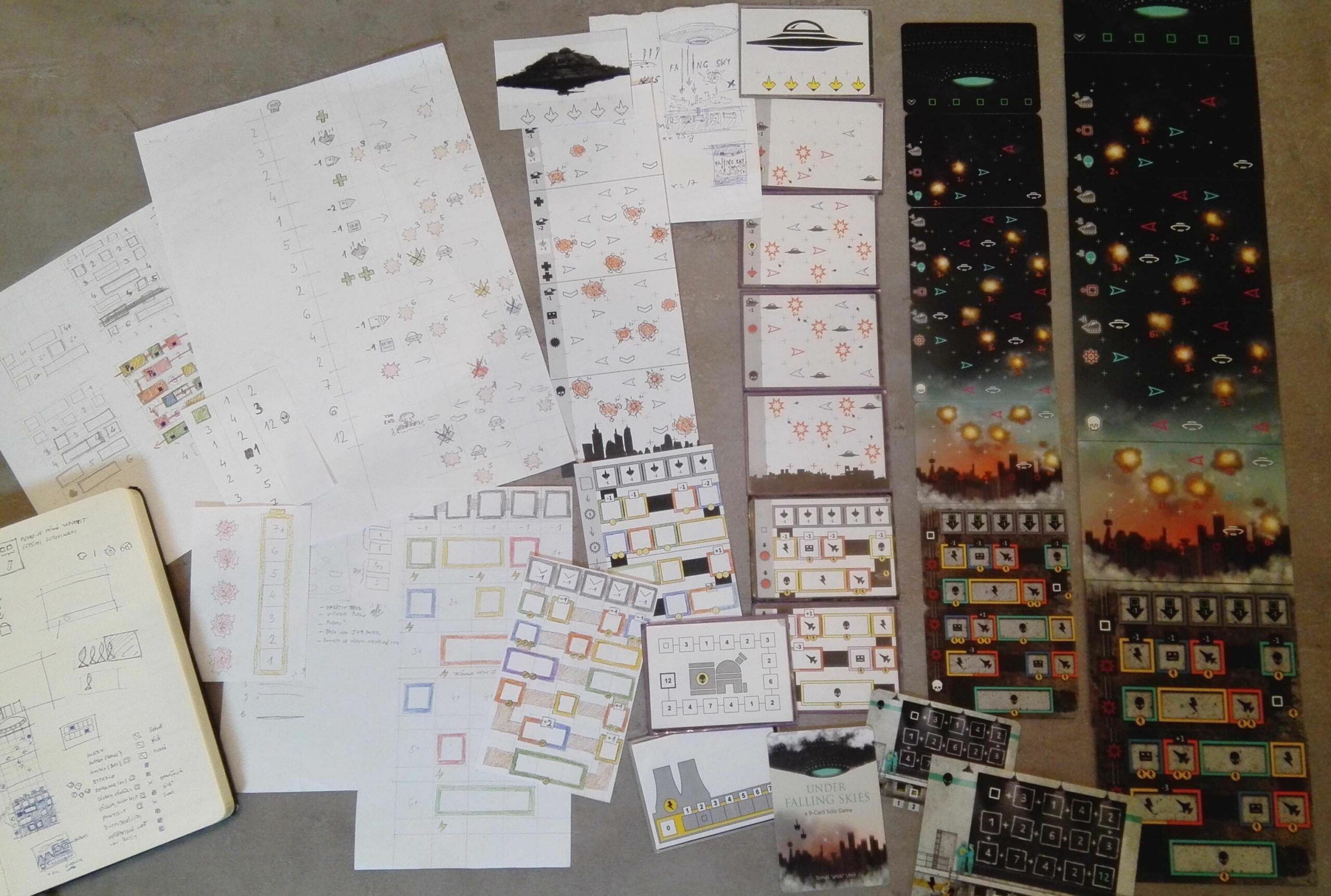
The original contest rules were very strict about using only 9 poker-sized cards and I needed to squeeze quite a lot of information on them. Just look at the base card for example, there needs to be 5 columns of rooms, each of them being big enough to accommodate a six-sided die, plus one extra column for tracking damage. It uses the card size to its fullest. And it’s not better with the sky tiles, apart from the five columns for enemy ships, there needs to be a space for the mothership effects.
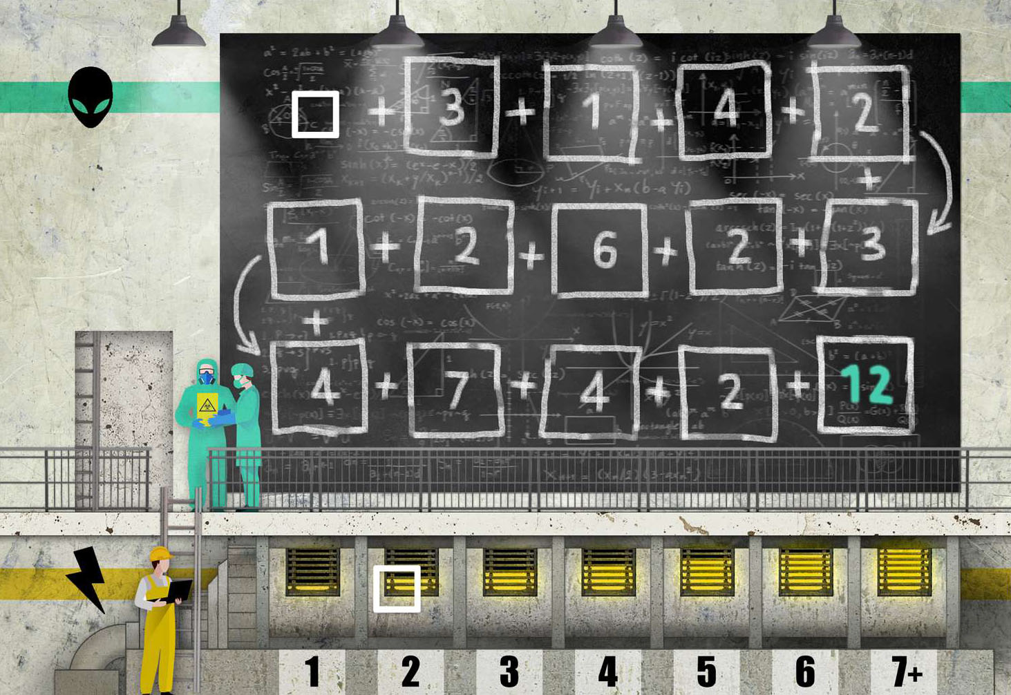
 So, while the original print&play version is quite elegant in many aspects, there are a few small things that goes against this elegance. All cards you use in the game form a nice sleek column, except for this one separate card, holding the energy and a research track.
Back then, when I was working on the print&play version, I had a few ideas that were not possible to use due to contest limitations. But when CGE decided to publish the game, it was suddenly possible to return to them.
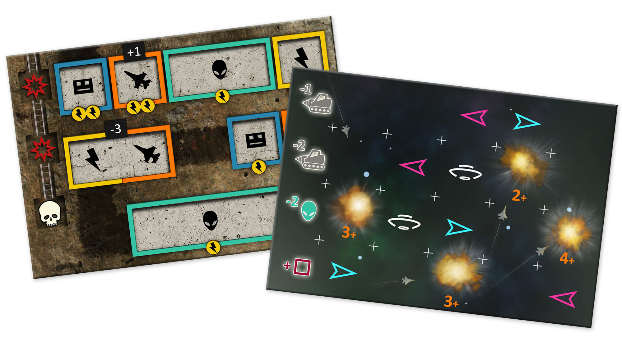
One of the first things we did with the new version, was widening the board and incorporating the energy track into the base tiles. It just makes so much sense to have the energy track next to the rooms which use it.
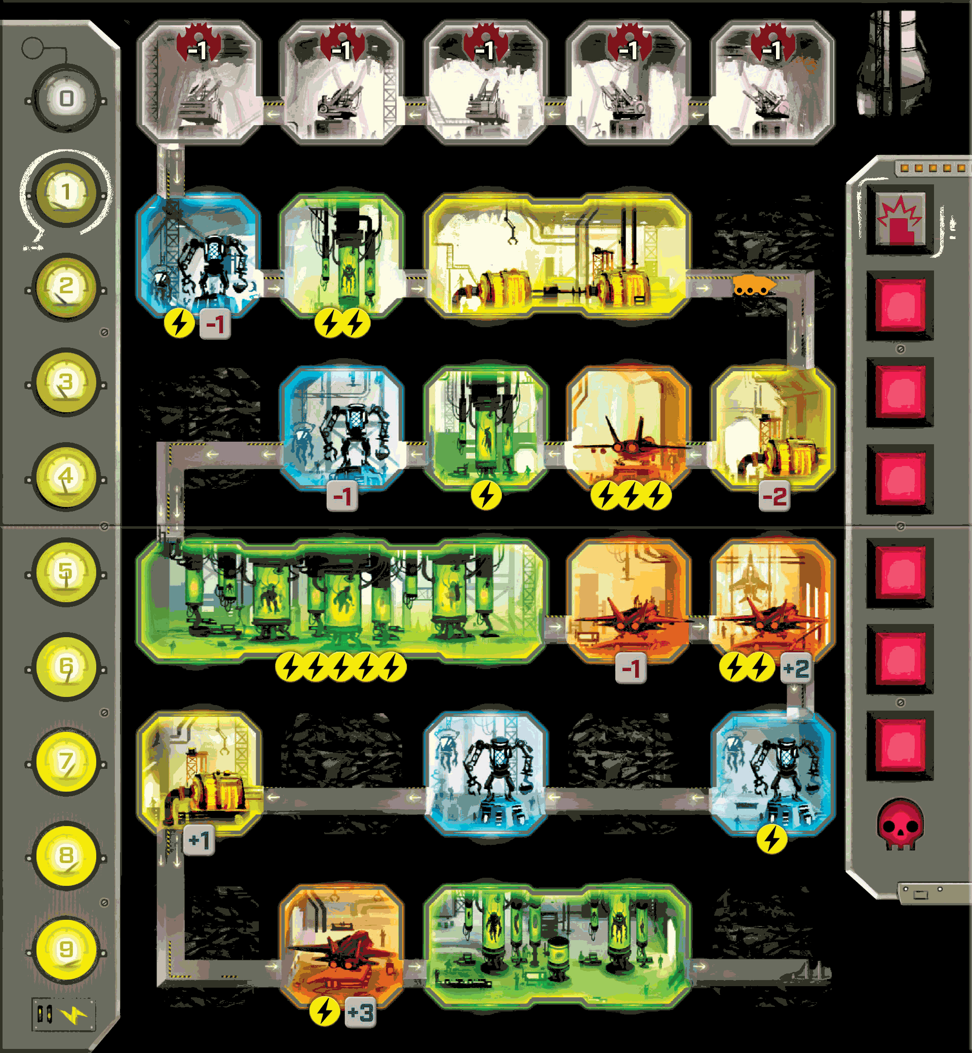
From the picture above, you can spot many other small tweaks to avoid some of the occasional issues – adding decent arrows in the tunnel to make sure players move the excavator correctly, putting the modifiers to the bottom of the rooms so you don’t cover them with dice, marking tunnels as spaces, etc. So many little details that we have been able to address, often thanks to the feedback from the print&play version players.
One of the bigger questions was how to approach the rooms. While the minimalist room icons from the original version have their appeal, I always imagined the rooms being drawn with an interior, adding to the atmosphere. But it’s something very tricky, because when done poorly, it can very easily hurt the usability. At one point, I was really torn between using icons and illustrating the rooms, but luckily, Kwanchai Moriya did a great job, the final product looks amazing, while still being very clear.

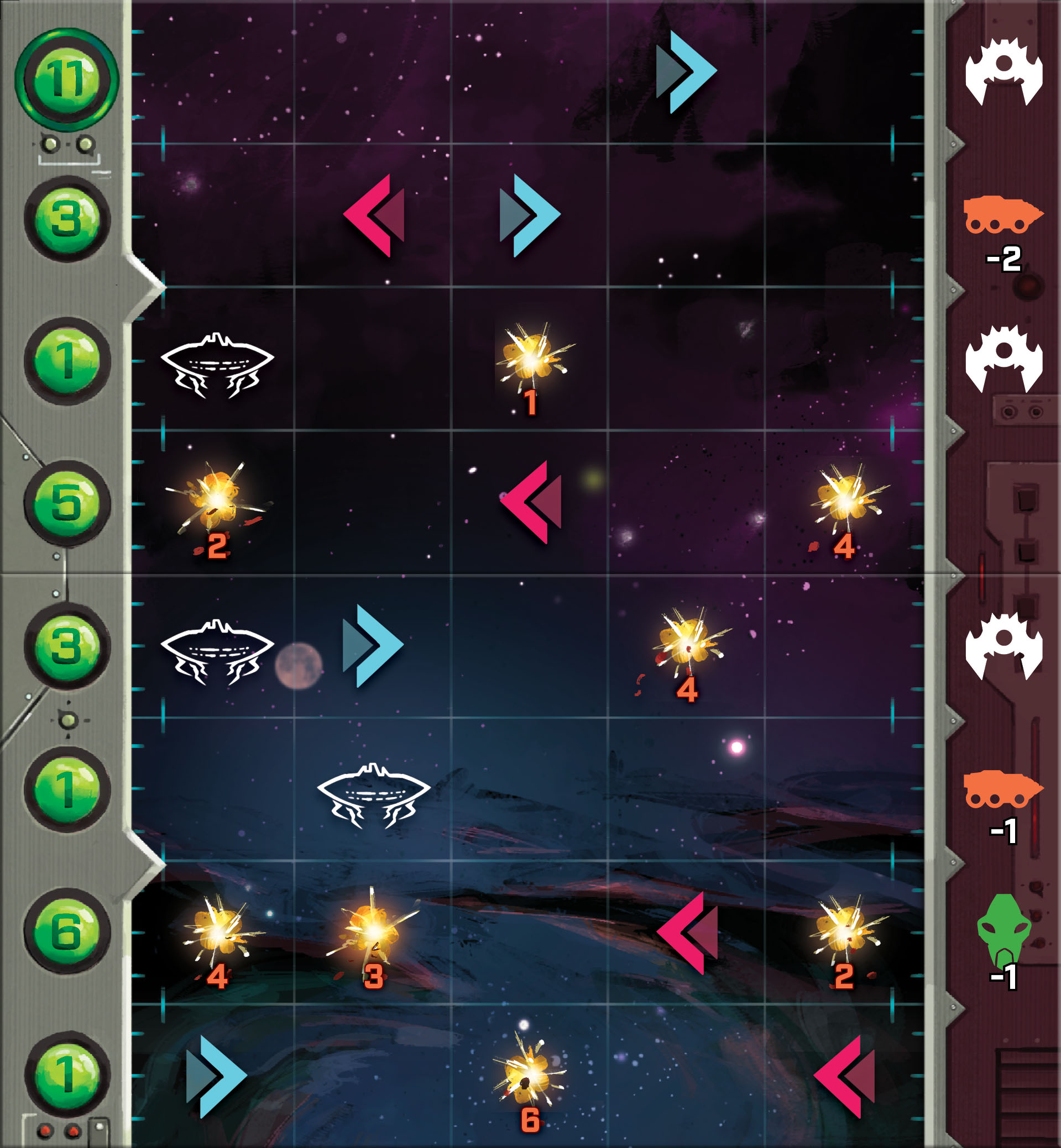
Similarly to the energy track changes, the research track became a part of the sky tiles. Apart from making the board more compact, it has some other benefits. Since the whole research track length is divided into four sky tiles, it offers even more variability through different tiles configuration.
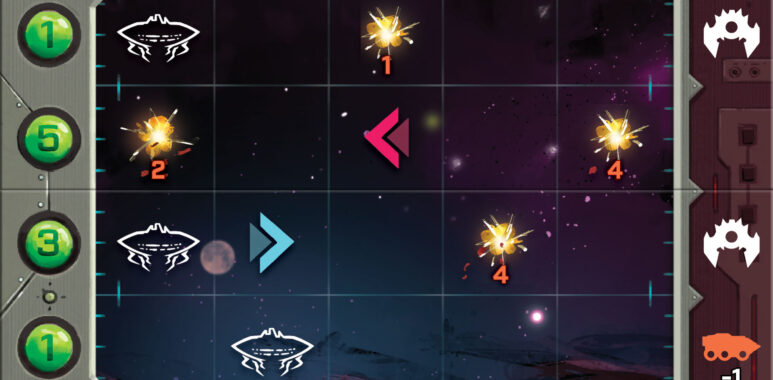
Again, there are some other small changes helping the overall usability, like adding a decent grid for example.
And finally, this is how it looks all put together. Note that while most of the elements are in place, it’s still a work in progress.
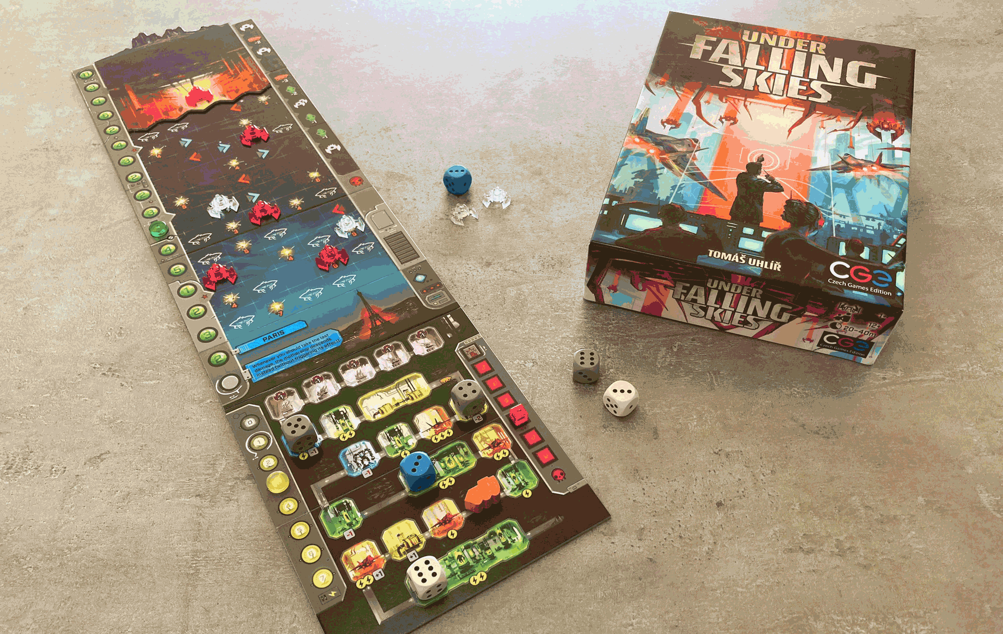
You may be curious about that separate city tile, it’s a completely new element, allowing you to defend a different city every time you play. But more about the cities in one of the future posts… 
Published on boardgamegeek.com,
at Juni, 16th 2020.
Here you can find more information about Under Falling Skies!

